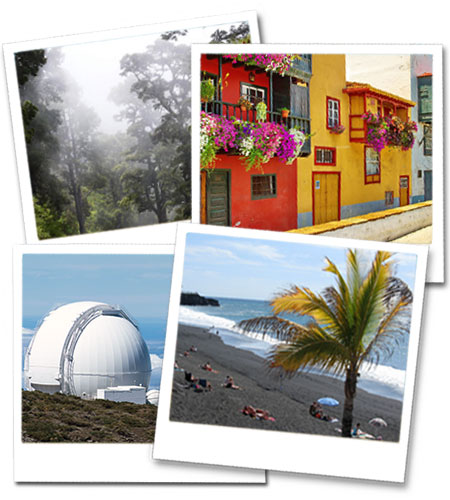
Website Images
Using images on a website

Websites aren't so different from magazines or advertising brochures. Would you browse through a magazine that didn't have any images to break up the pages? Probably not. Images, or at least good quality images, add visual appeal to websites. No matter how interesting your page content is, images add something extra. Regardless of the type of images you use, photos of the products you want to sell, your staff, your facilities, or just generic images, they all help engage visitor interest.
Should I use professional photos?
As with any form of advertising or makreting campaign, it makes sense to invest a little money in getting a few professionally-taken photos to use on your website, if you can. If you don't want to pay a photographer and don't have good quality images of your own, pay a visit to an online picture library and look for suitable images there. They will be generic, but good quality. You'll often need to pay for images taken from a picture library, but the quality is usually very good and the prices aren't too high.
When choosing the images for your website, try to plan them page by page. Keep the topic of each page in mind and find photos that fit in with the text. It also pays to think about the size and shape of images.
If you want a photo to sit alongside text, it will generally need to be portrait format (taller than wide) whereas if you want a full-screen image, it needs to be landscape format (wider than tall). If you want to use a full-width image, it needs to be about 1900px wide (or bigger) and about 500-600px tall. Remember that a photo may look beautiful at full size, but might not look as good if we need to crop it to fit into a small space.
We can optimise images to reduce their file size, but too many photos on a page will cause it to load more slowly, so don't plan to use dozens of images on anything other than a gallery page. If possible, aim to supply us with more images than you actually need. That way, if one or two don't work for one reason or another, we will have alternatives.
Background images
Some websites use a plain-coloured background, a simple colour block, as we use on most pages of this site. However, this can be replaced with either a pattern tile or even a single page-width image. As an example, take a look at our order form pages, which use a simple image for the background. If you like the full-screen image idea, remember that the images should not distract visitors from your text, and that most of the image will be hidden underneath text.
What if you can't find the right images?
If you can't find enough suitable images of your own, try browsing one of the image libraries listed below. In most cases you will have to pay a licencing fee to use professional images, and these fees are payable by you, even if you ask us to find them for you. Below you will find links to some of the more popular image library websites. Some charge fees for their images, while others allow you to use them free of charge. Free images often require attribution (you have to say where they came from).
